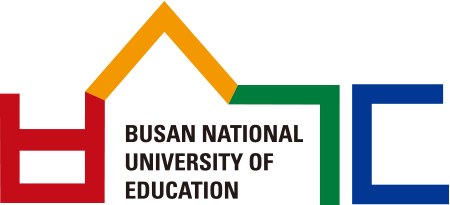
Symbol mark
Symbol mark
Mark LOGO TYPE
Unlike corporate logos, which often emphasize modern or decorative styles, university logotypes are generally more conservative, as they represent the institution’s identity through letters. Accordingly, the University’s logotype was created in a Gothic style to embody a firm and enduring image that reflects its past, present, and future.

-
University Identify Program, UIP
The University’s image integration project was initiated in 2001, when the University commissioned Professor Won-il Jeong of the Department of Art Education to lead the design. Following two years of research and surveys, the foundational materials were completed, and the design phase commenced, resulting in the final version on April 16, 2003. While most Korean university emblems had traditionally adopted a circular structure, international practices and contemporary design trends favored a more developmental form. Accordingly, the University established the principle of departing from the conventional circular design and adopting an open, developmental structure. After more than two years of work, the current design was completed and subsequently finalised through three reviews by the Academic Affairs Committee.
-
Design Concept of the Symbol Mark
As the emblem of the University, the symbol mark must be simple and able to convey the University’s image clearly and effectively. For this reason, the CI design team adopted an open, developmental structure as its basic concept, one that would be appropriate for the coming digital age. The University’s symbol mark was created using the consonants of “Busan National University of Education” (ㅂ, ㅅ, ㄱ, ㄷ) from the Korean alphabet. Overall, the design symbolises both the University’s academic character and its buildings.


